UI / UX Design
Connective
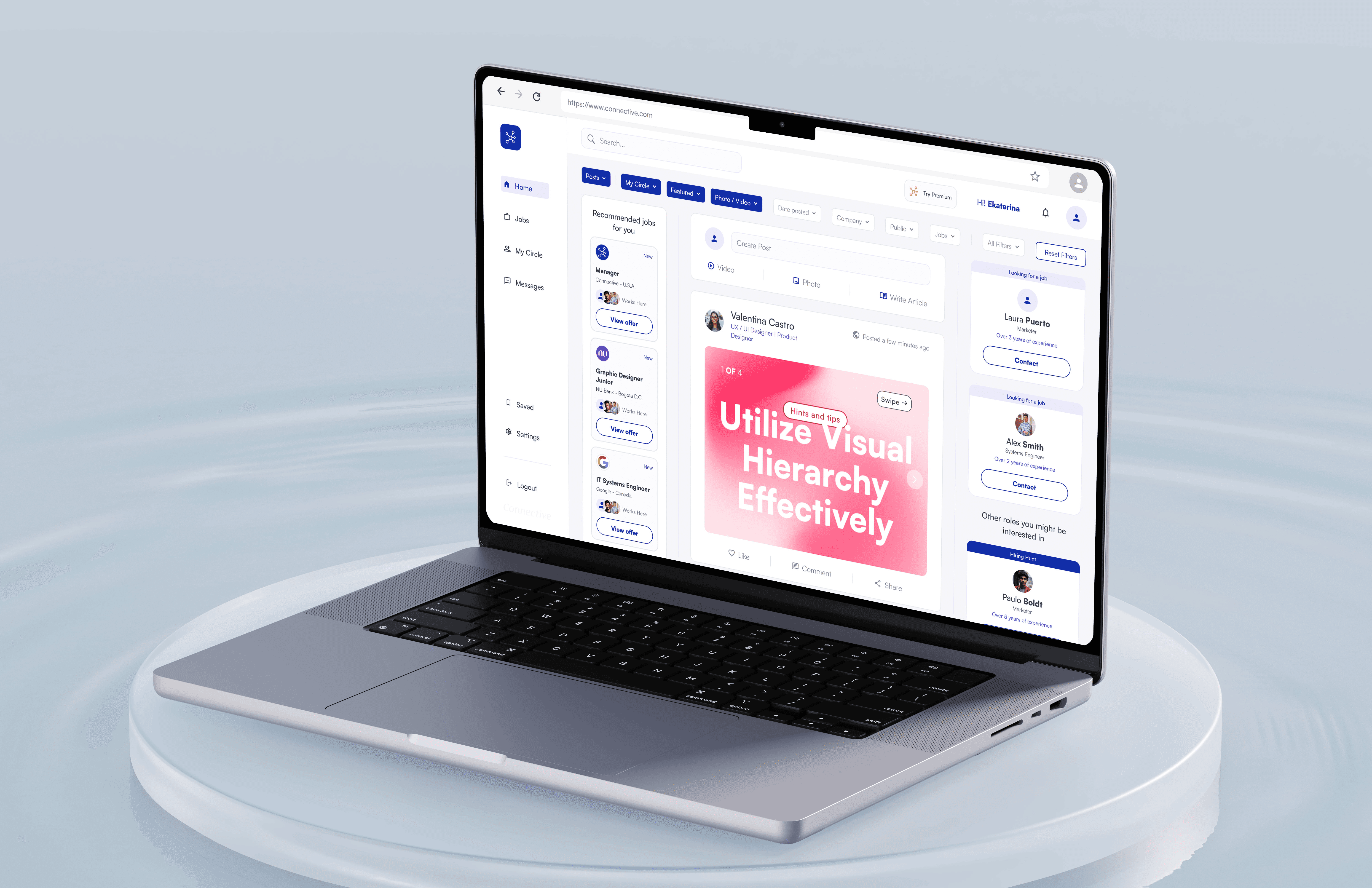
Connective is a digital platform focused on strengthening communication and collaboration within distributed teams.
Role:
Lead UX/UI Designer
Industry:
Software & Technology
Project Duration:
8 weeks
Year:
2025

The Challenge
Remote and hybrid work environments have amplified communication gaps. Teams often rely on multiple fragmented tools that create noise instead of clarity. The objective of this project was to design an intuitive, emotionally intelligent interface that fosters trust, clarity, and engagement in professional environments.
Through initial discovery, I identified three core challenges:
Communication platforms often prioritize features over human interaction.
Users experience cognitive overload due to complex navigation and cluttered interfaces.
Emotional tone and contextual clarity are rarely considered in professional collaboration tools.
The challenge was to design a platform that balances functionality with human experience — structured yet approachable.
Understanding the User
Primary users included:
Remote team members
Project managers
Cross-functional collaborators
Distributed startups
Key behavioral insights:
Users need context before action.
They value clarity over density.
They expect fast access to relevant information.
They want collaboration tools that feel lightweight, not overwhelming.
One critical insight: productivity improves when communication feels structured but natural.
Design Strategy
My strategy focused on three pillars:
Structure Reduces Anxiety
Clear layout and predictable navigation reduce friction and increase user confidence.
Context Before Action
Users should understand where they are and why something matters before interacting.
Emotional Clarity in UI
Tone, spacing, and visual hierarchy directly influence perceived trust and professionalism.
The design needed to feel calm, modern, and supportive — not corporate or sterile.
Process
Research & Competitive Review
I analyzed collaboration tools to understand:
Notification systems
Task organization
Message threading
Role-based permissions
I identified recurring problems:
Overloaded dashboards.
Confusing information hierarchy.
Excessive emphasis on metrics over collaboration quality.
Information Architecture
I redesigned the structure to:
Separate communication from task visibility.
Reduce navigation layers.
Highlight priority actions.
Create logical content grouping.
This reduced interaction cost and improved orientation within the platform.
Wireframes
Low-fidelity prototypes focused on:
Clear visual hierarchy.
Strong content grouping.
Primary vs secondary action distinction.
Eliminating unnecessary UI noise.
At this stage, we intentionally simplified interactions before adding visual styling.
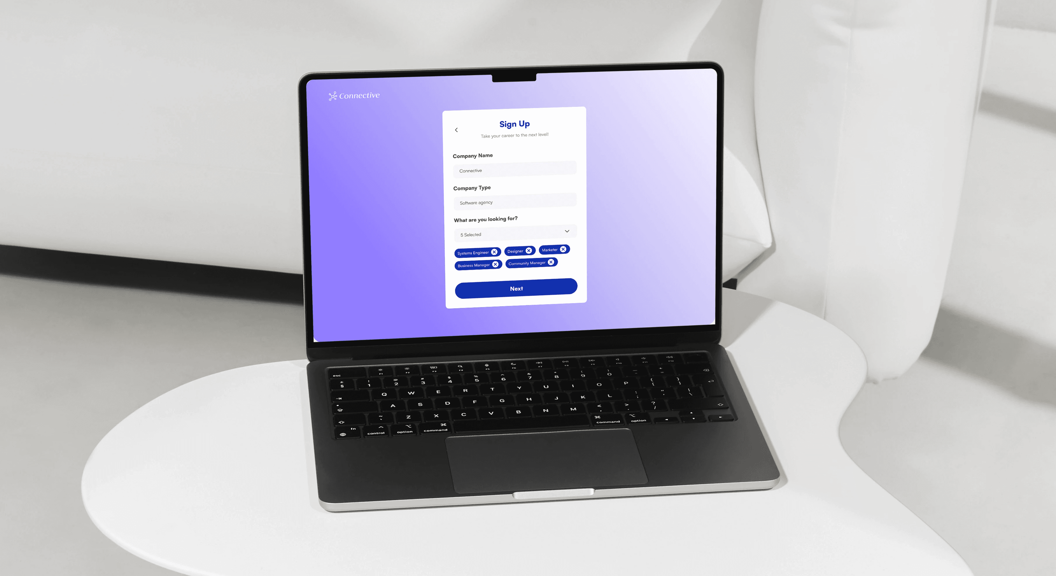
High-Fidelity UI
The final design introduced:
A neutral, calming color palette with strategic accent use.
Defined spacing system for breathing room.
Consistent component library.
Clear typography scale for readability.
I avoided overusing color or decoration. Instead, emphasis is created through:
Weight contrast.
Strategic whitespace.
Subtle elevation and depth.
This reinforces clarity and focus.
Design Experience
Interaction Design
Key interaction improvements included:
Clear feedback states.
Simplified action flows.
Reduced modal dependency.
Improved notification visibility without visual overload.
I designed micro-interactions to feel responsive but unobtrusive.
Responsive Design
Mobile optimization prioritized:
Message readability.
Quick reply functionality.
Simplified navigation.
Context preservation across screen sizes.
Rather than compressing desktop features, we restructured content hierarchy for smaller screens.
Design System
To ensure long-term scalability, we created:
A 12-column responsive grid.
Defined spacing tokens.
Button hierarchy (Primary / Secondary / Neutral).
State system (Success / Warning / Info / Error).
Typography scale with consistent rhythm.
The system supports feature expansion without compromising coherence.
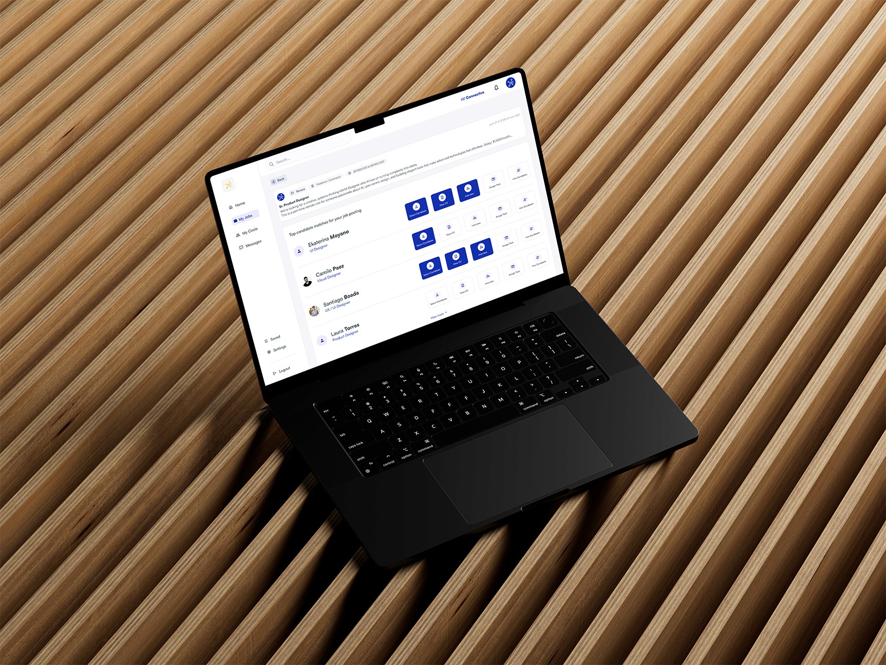
Results & Impact
The redesigned experience achieved:
Clearer communication flows.
Reduced cognitive friction.
Improved onboarding clarity.
Stronger visual identity aligned with collaboration and trust.
Most importantly, the platform now communicates stability and intentionality — critical attributes for professional collaboration tools.
Key Learnings
Collaboration tools must prioritize clarity over density.
Emotional tone influences perceived usability.
Simplicity requires discipline, not minimalism.
Scalable systems outperform isolated UI decisions.
If iterated further, I would:
Conduct usability testing on message threading.
Measure engagement across collaboration features.
Refine onboarding microcopy to reduce initial hesitation.